A rounded button is a button that has corners rounded to the radius that can be specified. In this tutorial, you will create rounded buttons the easy way.
Let’s get started
In this Article
Methods to Create Rounded Button
You can create a rounded button using these five methods.
- Use ElevatedButton
- Use OutlinedButton
- Use TextButton
- Use InkWell
- Use GestureDetector
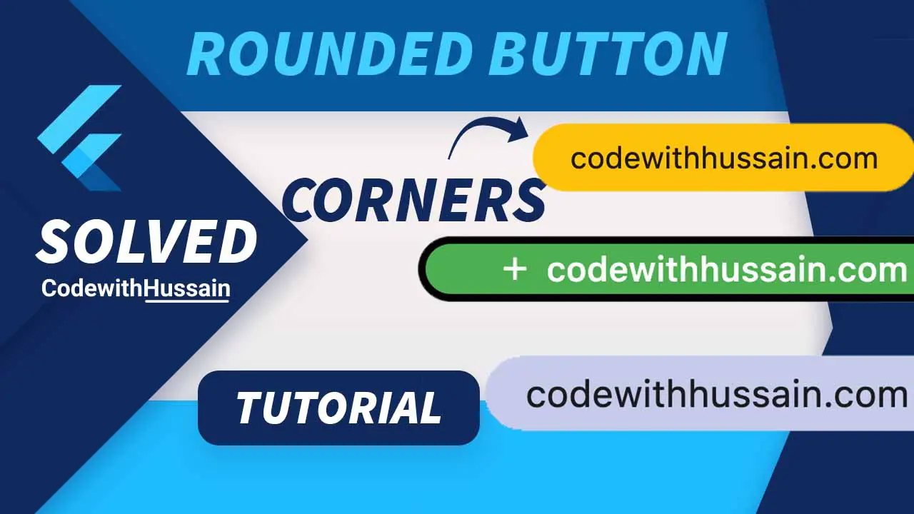
Method 1: Use ElevatedButton
In this example, you will implement a rounded button using the ElevatedButton widget.
RoundedRectangularBorder
Preview:
Code:
ElevatedButton(
style: ElevatedButton.styleFrom(
padding: const EdgeInsets.symmetric(horizontal: 50, vertical: 16),
shape: RoundedRectangleBorder(
borderRadius: BorderRadius.circular(24),
),
),
child: const Text(
'codewithhussain.com',
style: TextStyle(fontSize: 22),
),
onPressed: () {},
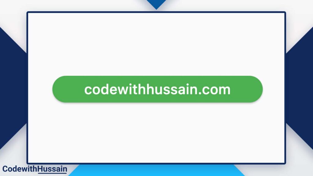
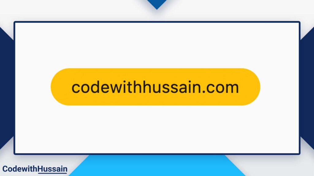
),StadiumBorder
The super simple method is to use StadiumBorder.
Preview:
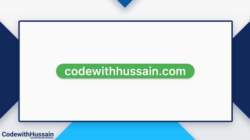
Code:
ElevatedButton(
  style: ElevatedButton.styleFrom(
    shape: const StadiumBorder(),
  ),
  child: const Text(
    'codewithhussain.com',
    style: TextStyle(fontSize: 22),
  ),
  onPressed: () {},
),
Rounded Button with Icon and Text
It is super easy to add an Icon to the rounded button.
Preview:
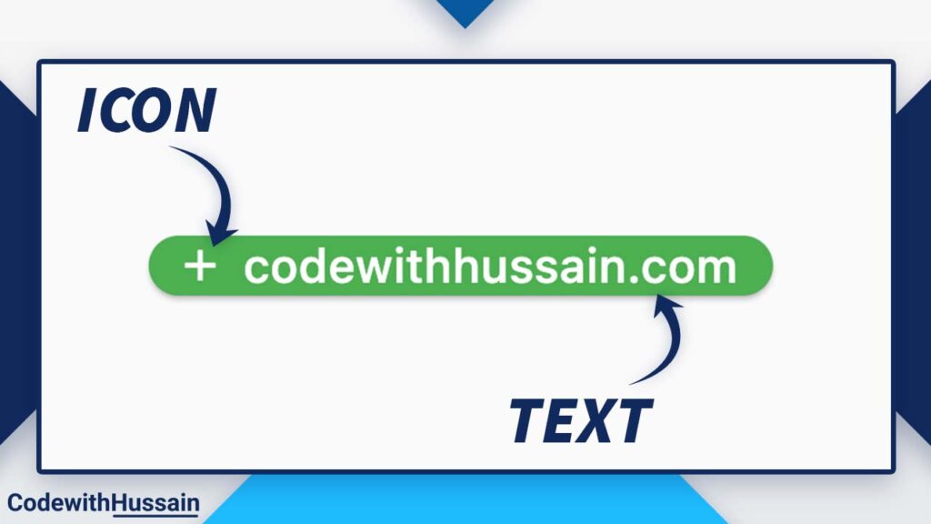
Code:
ElevatedButton.icon(
  style: ElevatedButton.styleFrom(
    shape: const StadiumBorder(),
  ),
  icon: const Icon(Icons.add),
  label: const Text(
    'codewithhussain.com',
    style: TextStyle(fontSize: 22),
  ),
  onPressed: () {},
),
You just have to use ElevatedButton.icon() and set the icon and label property with the style. And you have a rounded button with an icon.
Note: FlatButton and RaisedButton are deprecated.
Customizations
Let’s see how we can further customize the Rounded Button in flutter.
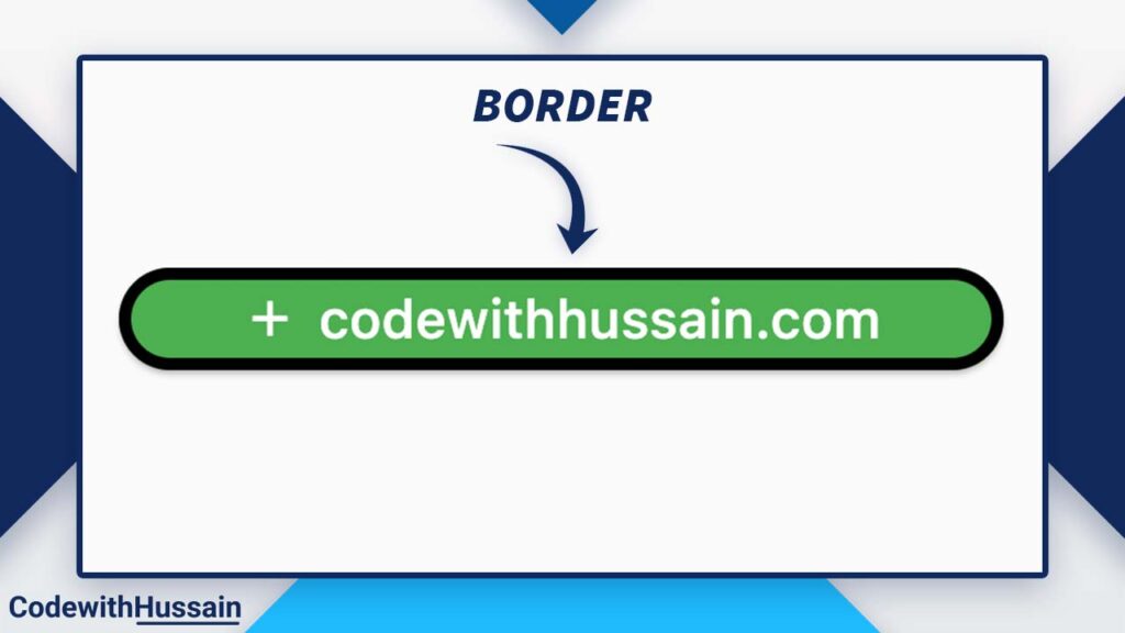
If you like you can add a border.
Add Border
Preview:
Code:
ElevatedButton.icon(
  style: ElevatedButton.styleFrom(
    padding: const EdgeInsets.symmetric(horizontal: 50, vertical: 16),
    shape: RoundedRectangleBorder(
      borderRadius: BorderRadius.circular(24),
      side: const BorderSide(color: Colors.black, width: 5),
    ),
  ),
  icon: const Icon(Icons.add),
  label: const Text(
    'codewithhussain.com',
    style: TextStyle(fontSize: 22),
  ),
  onPressed: () {},
),
You will use the side property of the RoundedRectangleBorder. Inside the side property you define BorderSide with the border color and width.
That’s how you add a border in flutter.
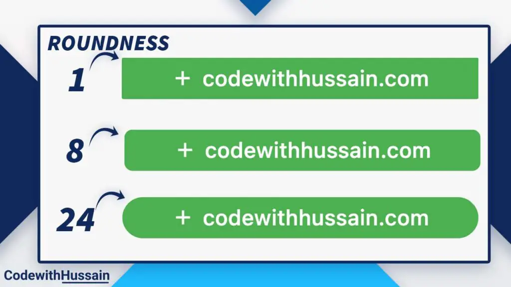
Control the Rounded Corners
If you want to control the roundness of the button.
You can do that using this method
Preview:
Code:
ElevatedButton.icon(
  style: ElevatedButton.styleFrom(
    padding: const EdgeInsets.symmetric(horizontal: 50, vertical: 16),
    shape: RoundedRectangleBorder(
      borderRadius: BorderRadius.circular(24), //1  //8 //24
    ),
  ),
  icon: const Icon(Icons.add),
  label: const Text(
    'codewithhussain.com',
    style: TextStyle(fontSize: 22),
  ),
  onPressed: () {},
),
RoundedRectangleBorder has borderRadius property where we specify the BorderRadius.circular(our radius value).
You can specify the radius value to change the roundness of the button.
Notice: You are using BorderRadius.circular() which add circular border effect.
Explanation
What is a Rounded Button?
When you are working in a team you have to design the app according to the UX that you get from the designer.
Now UI of the app has a rounded button.
You notice that ElevatedButton with default settings does not give that feel of roundness.
So,
You decided to customize.
A rounded Button is a button that has rounded corners. You create those rounded corners by defining readius.
Now you have the button according to the UI given by the designer.
Other Methods
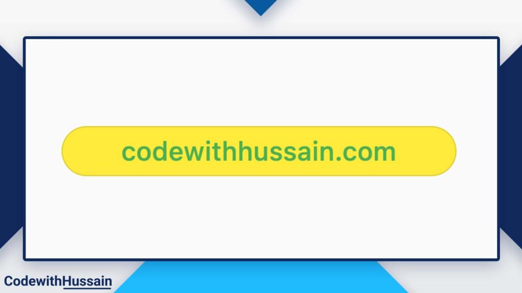
Method 2: Use OutlinedButton
Preview:
Code:
OutlinedButton(
style: OutlinedButton.styleFrom(
  padding: const EdgeInsets.symmetric(horizontal: 50, vertical: 16),
  backgroundColor: Colors.yellow,
  shape: RoundedRectangleBorder(
    borderRadius: BorderRadius.circular(24),
  ),
),
child: const Text(
  'codewithhussain.com',
  style: TextStyle(fontSize: 22),
),
onPressed: () {},
)
In this example, you can see OutlinedButton is also available for creating rounded button.
Here you have the OutlinedButton.styleFrom() which you can assign to the style property of the OutlinedButton.
You can specify shape to add RoundedRectangleBorder() with borderRadius.
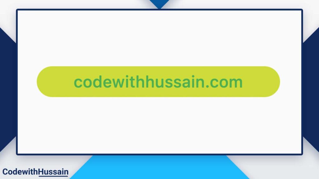
Method 3: Use TextButton
Preview:
Code:
TextButton(
  style: TextButton.styleFrom(
    padding: const EdgeInsets.symmetric(horizontal: 50, vertical: 16),
    backgroundColor: Colors.lime,
    shape: RoundedRectangleBorder(
      borderRadius: BorderRadius.circular(24),
    ),
  ),
  child: const Text(
    'codewithhussain.com',
    style: TextStyle(fontSize: 22),
  ),
  onPressed: () {},
),
TextButton is also useful for creating this button. Here You use the TextButton.styleFrom() to produce this button.
Method 4: Use InkWell
Preview:
Code:
Material(
  color: Colors.amber,
  borderRadius: BorderRadius.circular(50),
  child: InkWell(
    splashColor: Colors.yellow,
    onTap: () {},
    borderRadius: BorderRadius.circular(50),
    child: Container(
      width: 280,
      height: 50,
      alignment: Alignment.center,
      child: const Text(
        'codewithhussain.com',
        style: TextStyle(fontSize: 22),
      ),
    ),
  ),
),
Why do we use Material Widget in this Example?
We use the Material widget to give color to the button.
Control the Splash Colors
You can also control the button ripple effect color (splash color) by changing splashColor property.
splashColor: Colors.yellow,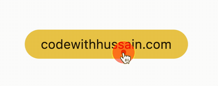
Method 5: Use GestureDetector:
Preview:
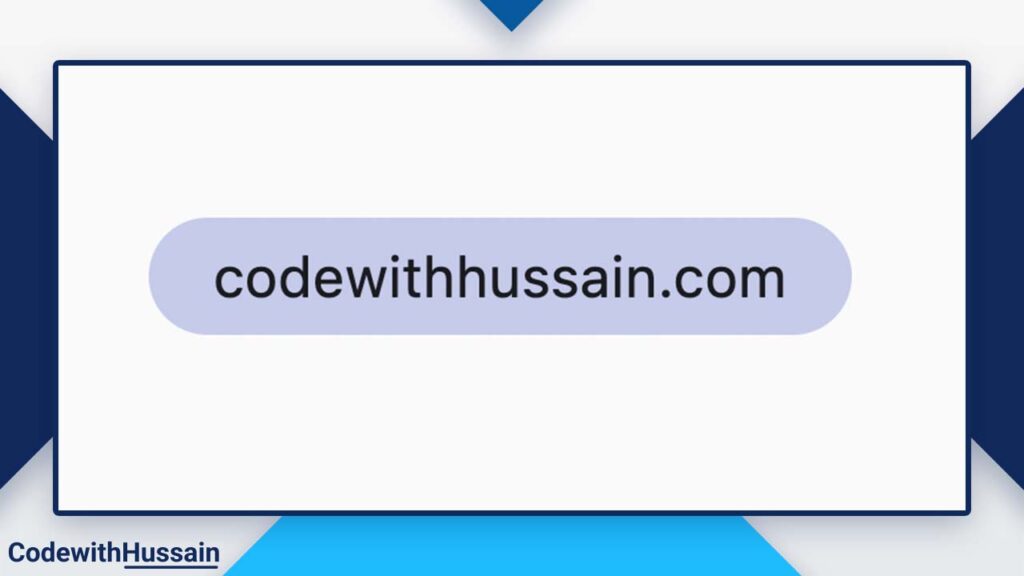
Code:
GestureDetector(
  onTap: () {},
  child: Container(
    width: 300,
    height: 50,
    decoration: BoxDecoration(
      borderRadius: BorderRadius.circular(50),
      color: Colors.indigo.shade100,
    ),
    child: const Center(
      child: Text(
        'codewithhussain.com',
        style: TextStyle(fontSize: 24),
      ),
    ),
  ),
),Note: It doesn’t provide a ripple effect.
Conclusion
Read more
- Flutter Change Android minsdkversion
- Flutter update app version
- Flutter AnimatedBuilder Example
- Flutter SliverGrid
- Flutter Loading Indicator
- Flutter Get Device Id
I hope you like this flutter tutorial. Thanks!
