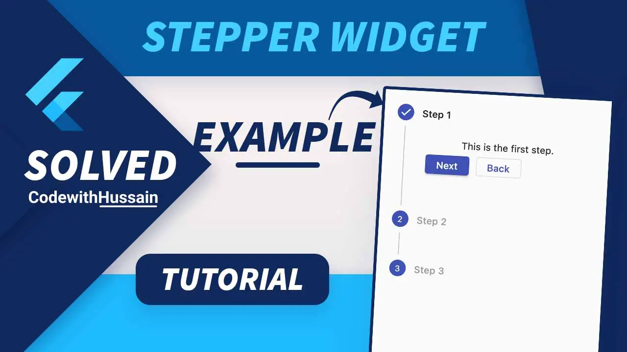
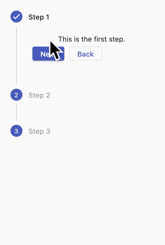
The Flutter Stepper widget is a widget that shows the progress sequence through steps.
Stepper is used in forms. It helps us to improve the UX by dividing the UI components into different steps.
Let’s see how we can use Stepper widget inside Flutter.
In this Article
Preview
Complete App Code:
The complete code is here, further explanation is available below.
import 'package:flutter/material.dart';

void main() {
  runApp(const MyApp());
}

class MyApp extends StatelessWidget {
  const MyApp({super.key});

  @override
  Widget build(BuildContext context) {
    return MaterialApp(
      debugShowCheckedModeBanner: false,
      title: 'CodeWithHussain.com',
      theme: ThemeData(
        primarySwatch: Colors.indigo,
      ),
      home: const HomeScreen(),
    );
  }
}

class HomeScreen extends StatefulWidget {
  const HomeScreen({super.key});

  @override
  State<HomeScreen> createState() => _HomeScreenState();
}

class _HomeScreenState extends State<HomeScreen> {
  int currentStep = 0;
  continueStep() {
    if (currentStep < 2) {
      setState(() {
        currentStep = currentStep + 1; //currentStep+=1;
      });
    }
  }

  cancelStep() {
    if (currentStep > 0) {
      setState(() {
        currentStep = currentStep - 1; //currentStep-=1;
      });
    }
  }

  onStepTapped(int value) {
    setState(() {
      currentStep = value;
    });
  }

  Widget controlBuilders(context, details) {
    return Padding(
      padding: const EdgeInsets.all(8.0),
      child: Row(
        children: [
          ElevatedButton(
            onPressed: details.onStepContinue,
            child: const Text('Next'),
          ),
          const SizedBox(width: 10),
          OutlinedButton(
            onPressed: details.onStepCancel,
            child: const Text('Back'),
          ),
        ],
      ),
    );
  }

  @override
  Widget build(BuildContext context) {
    return Scaffold(
      body: Stepper(
        elevation: 0, //Horizontal Impact
        // margin: const EdgeInsets.all(20), //vertical impact
        controlsBuilder: controlBuilders,
        type: StepperType.vertical,
        physics: const ScrollPhysics(),
        onStepTapped: onStepTapped,
        onStepContinue: continueStep,
        onStepCancel: cancelStep,
        currentStep: currentStep, //0, 1, 2
        steps: [
          Step(
              title: const Text('Step 1'),
              content: Column(
                children: const [
                  Text('This is the first step.'),
                ],
              ),
              isActive: currentStep >= 0,
              state:
                  currentStep >= 0 ? StepState.complete : StepState.disabled),
          Step(
            title: const Text('Step 2'),
            content: const Text('This is the Second step.'),
            isActive: currentStep >= 0,
            state: currentStep >= 1 ? StepState.complete : StepState.disabled,
          ),
          Step(
            title: const Text('Step 3'),
            content: const Text('This is the Third step.'),
            isActive: currentStep >= 0,
            state: currentStep >= 2 ? StepState.complete : StepState.disabled,
          ),
        ],
      ),
    );
  }
}
Explanation
You can create a stepper in your app by following these steps:
Step 1: Create a Stateful Widget
class HomeScreen extends StatefulWidget {
  const HomeScreen({super.key});

  @override
  State<HomeScreen> createState() => _HomeScreenState();
}

class _HomeScreenState extends State<HomeScreen> {
//Here We create some state widgets
  @override
  Widget build(BuildContext context) {
    return Scaffold(
      body: //Here We show Stepper
    );
  }
}
First, we create a Stateful widget. We create some state variables for controlling the state of the Stepper.
Step 2: Create a simple Stepper
Scaffold(
      body: Stepper(
        steps: [
          Step(
            title: const Text('Step 1'),
            content: Column(
              children: const [
                Text('This is the first step.'),
              ],
            ),
          ),
          Step(
            title: const Text('Step 2'),
            content: const Text('This is the Second step.'),
          ),
          Step(
            title: const Text('Step 3'),
            content: const Text('This is the Third step.'),
          ),
        ],
      ),
);Preview:
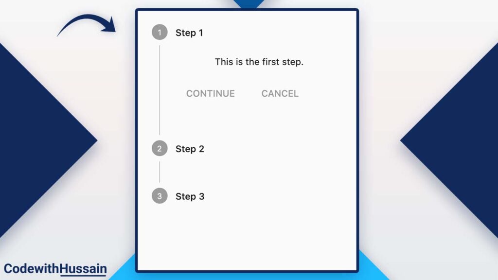
A basic stepper is showing on the screen. But each button is inactive.
Right now Step 1 is visible but we have no way to show Step 2 or Step 3.
Stepper has a few properties:
| steps | We use steps to show a list of Step widgets. |
| currentStep | Index of the Stepper current index. Start from 0. We can specify the index value here. Adding 1 here will expand the second step. (we create a state variable to dynamically change the index here) |
| onStepContinue | We can pass a function that will trigger when you click on the continue button. |
| onStepCancel | The function can be passed here which can be triggered when you click on the cancel button. |
| onStepTapped | When you click on the Step tile, this function will execute. It receives the index value of the tile that you tap. |
| type | Here we can specify StepperType.vertical and StepperType.horizontal to make the stepper vertical and horizontal style respectively. |
| controlsBuilder | This is special. Here you also pass a function that gets context and details from the framework and returns a Widget that will appear at the bottom of a step. (Use for customizing action buttons). |
| physics | You can specify the physics effect when your every step has many widgets and it becomes scrollable. |
| elevation | The horizontal stepper has elevation. double value can be used for adding elevation (shadow). |
Step 3: Create State and Methods For Stepper
Let’s see what we can do inside the Stateful widget.
currentStep variable
int currentStep = 0;This variable will make sure what we should display on the screen.
continueStep Method
  continueStep() {
    if (currentStep < 2) {
      setState(() {
        currentStep = currentStep + 1; //currentStep+=1;
      });
    }
  }
This method will be executed when the user press the continue button of the Stepper.
Also here we specify the logic that this button only performs its function if its index is less than the length of the Stepper.
When it runs its currentStep value will be increased by 1.
cancelStep Method
  cancelStep() {
    if (currentStep > 0) {
      setState(() {
        currentStep = currentStep - 1; //currentStep-=1;
      });
    }
  }
This method will execute when the user will press the cancel button of the Stepper.
Here we decrease the currentStep by 1 only when the index is greater than 0.
onStepTapped(int value) Method
  onStepTapped(int value) {
    setState(() {
      currentStep = value;
    });
  }
This method will receive the index integer value from the Stepper.
We simply assign that value to the currentStep and update the state.
controlBuilders(context, details) Method
  Widget controlBuilders(context, details) {
    return Padding(
      padding: const EdgeInsets.all(8.0),
      child: Row(
        children: [
          ElevatedButton(
            onPressed: details.onStepContinue,
            child: const Text('Next'),
          ),
          const SizedBox(width: 10),
          OutlinedButton(
            onPressed: details.onStepCancel,
            child: const Text('Back'),
          ),
        ],
      ),
    );
  }
The method is used to replace the continue and Cancel buttons with custom-designed Next and Back buttons.
Note: Make sure you add the Row widget surrounding these buttons otherwise border position will be disturbed.
Step 4: Assign Methods to the Stepper
Scaffold(
      body: Stepper(
        elevation: 0, //Horizontal Impact
        // margin: const EdgeInsets.all(20), //vertical impact
        controlsBuilder: controlBuilders,
        type: StepperType.vertical,
        physics: const ScrollPhysics(),
        onStepTapped: onStepTapped,
        onStepContinue: continueStep,
        onStepCancel: cancelStep,
        currentStep: currentStep, //0, 1, 2
        steps: [
          /Here we specify the steps
        ],
      ),
    );
We just assign the all defined method to the stepper widget.
Step 5: Change State of Each Step
Step(
title: const Text('Step 1'),
content: Column(
children: const [
Text('This is the first step.'),
],
),
isActive: currentStep >= 0,
state:
currentStep >= 0 ? StepState.complete : StepState.disabled),
Step(
title: const Text('Step 2'),
content: const Text('This is the Second step.'),
isActive: currentStep >= 0,
state: currentStep >= 1 ? StepState.complete : StepState.disabled,
),
Step(
title: const Text('Step 3'),
content: const Text('This is the Third step.'),
isActive: currentStep >= 0,
state: currentStep >= 2 ? StepState.complete : StepState.disabled,
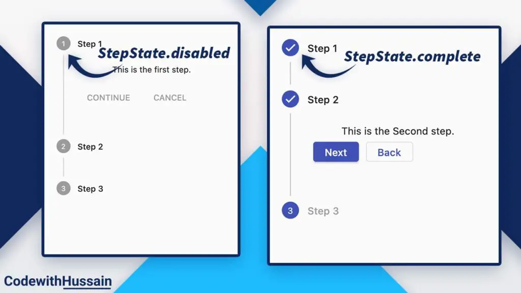
),Step widget has two most important properties:
isActive: true and false value (or condition that return true or false) can be specified
state: will receive a StepState value which is an enum value that you can give here.
| StepState.indexed | Display index |
| StepState.editing | Display pencil icon |
| StepState.complete | Display a tick icon |
| StepState.disabled | Disabled step (can’t be tapped) |
| StepState.error | Indicate error |
Note: You can see the complete code at the top. For more detail, you can also visit official docs.
Conclusion
In this article, you learn how you can create a Stepper widget in Flutter with an example.
See more:
- How to show drop down in flutter
- How to create rounded button in flutter
- How to update Flutter app version
- How to use Flutter AnimatedBuilder
- How to create ExpansionTile in Flutter
I hope you like this flutter tutorial. Thanks!

