Modern UI design use shimmer effects. Shimmer Effect is a loading indicator that is visible to the user when data is loading from the remote data source. This will increase user retention and improve the UX experience compared to the circular progress indicator.
You will learn how you can create a shimmer effect in Flutter.

You will create an app in which you show shimmer loading while the data is loading and once your app has data. That data will be shown on the UI screen.
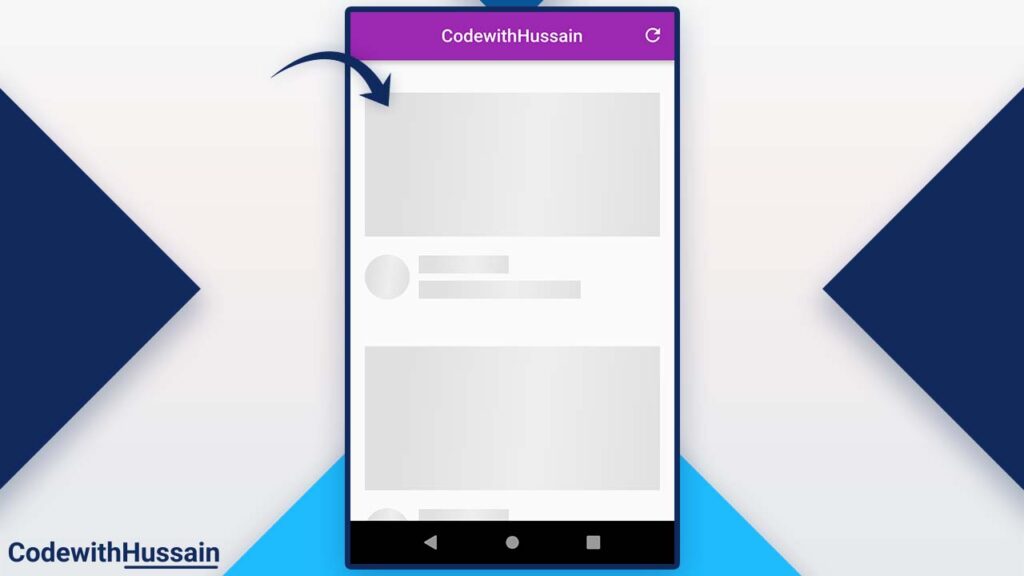
You can see the color animation inside the above preview. You create that animation by using the flutter shimmer package.
In this Article
Step 1: Install Shimmer Package
You will go the pub.dev and search the shimmer package to see the details after that you can install the shimmer in your example project by using the following command:
flutter pub add shimmerOr you can directly edit you pubspec.yaml file.
dependencies:
  shimmer: ^2.0.0
After installing shimmer in your project you will import the shimmer dependency in your UI file.
import 'package:shimmer/shimmer.dart';Once you install the shimmer package let’s move to that main example.
Step 2: Create Widgets in your Flutter Project
Now you have to create the Some Widget for following the example.
Let’s talk about the widgets that we create in this example.
You will create six widgets in this example.
| No | Widgets | Description |
| 1 | ShimmerScreen | This is the main UI screen in which which you have Scaffold() and other components. This is a StatefulWidget because your data loading state is here. |
| 2 | VideosList | This widget will demonstrate the actual UI Card (video cards list). That will be shown after loading from the backend. |
| 3 | VideoCard | This widget will represent a Single Card. We place the static content here for demonstration purposes. |
| 4 | ShimmerLoadingList | This is the list of the ShimmerCard widget. |
| 5 | ShimmerCard | This widget uses the ShimmerComponent widget to produce the look and feels that increases the User Experience. |
| 6 | ShimmerComponent | This widget uses the shimmer package and creates animation. You use this to produce Rectangular and Circular shimmers. |
Create a ShimmerScreen
Let’s first create a ShimmerScreen stateful widget where you create shimmers for your app.
You create a _isLoading state variable that will tell the UI whether data is loaded or not.
late bool _isLoading = false;after that, you create a _loadData() function.
You use the Future.delayed to produce the artificial loading time for data.
And change the state _isLoading accordingly.
Check this code:
  _loadData() {
    _isLoading = true;
    Future.delayed(const Duration(seconds: 2), () {
      setState(() {
        _isLoading = false;
      });
    });
  }
Load Data When Screen First Open
Now you know how to load data (by using the above code)? Now you will load that data when the screen is built the first time.
For that
You use the initState() method of the Stateful widget. You call the _loadData()function here.
 @override
  void initState() {
    _loadData();
    super.initState();
  }
Now let’s go inside the build() method of the ShimmerScreen.
Refresh Button
You create Scaffold() then AppBar() and inside the AppBar() action property list you pass the IconButton and when you press that IconButton you will execute onPressed.
AppBar(
        centerTitle: true,
        title: const Text('CodewithHussain'),
        actions: [
          IconButton(
            onPressed: () {

            },
            icon: const Icon(Icons.refresh),
          )
        ],
      ),
Where you set the state and load the data for refreshing the UI.
  setState(() {
       _loadData();
  });
Now inside the body, you will center everything by wrapping the UI inside the Center widget.
Important:
You will check the state variable _isLoading if the value is true (which means we are loading data from the data source) you show the ShimmerLoadingList() widget and if data is Loaded you show the VideoList which is actual data.
      body: Center(
        child: _isLoading ? const ShimmerLoadingList() : const VideosList(),
      ),
Shimmer Screen Complete Code:
class ShimmerScreen extends StatefulWidget {
  const ShimmerScreen({Key? key}) : super(key: key);

  @override
  State<ShimmerScreen> createState() => _ShimmerScreenState();
}

class _ShimmerScreenState extends State<ShimmerScreen> {
  late bool _isLoading = false;

  _loadData() {
    _isLoading = true;
    Future.delayed(const Duration(seconds: 2), () {
      setState(() {
        _isLoading = false;
      });
    });
  }

  @override
  void initState() {
    _loadData();
    super.initState();
  }

  @override
  Widget build(BuildContext context) {
    return Scaffold(
      appBar: AppBar(
        centerTitle: true,
        title: const Text('CodewithHussain'),
        actions: [
          IconButton(
            onPressed: () {
              setState(() {
                _loadData();
              });
            },
            icon: const Icon(Icons.refresh),
          )
        ],
      ),
      body: Center(
        child: _isLoading ? const ShimmerLoadingList() : const VideosList(),
      ),
    );
  }
}
After creating the shimmering screen you will create a shimmer which means you create a ShimmerComponent widget which will create a shimmer effect for us.
Create a ShimmerComponent
Now it’s time to create a ShimmerComponent widget that will produce two types of shimmers for us.
- Rectangular Shimmer
- Circular Shimmer
How do you create rectangular and circular shimmer in a single ShimmerComponent widget?
You use dart named constructor for this widget instead of the default constructor.
- ShimmerComponent.rectangular()
- ShimmerComponent.circular()
You create three final variables(width, height, shapeBorder) inside this ShimmerComponent widget.
final double width;
final double height;
final ShapeBorder shapeBorder;
Then you create the first-named constructor:
ShimmerComponent.rectangular()
const ShimmerComponent.rectangular({
  Key? key,
  this.width = double.infinity,
  required this.height,
})  : shapeBorder = const RoundedRectangleBorder(),
      super(key: key);
You will assign the width a double.infinity value which will make this shimmer width by default to the width of the screen.
and take the height as a required parameter.
You initialize the shapeBorder with RoudedRectangleBorder().
After that you will create the second named constructor:
ShimmerComponent.circular()
  const ShimmerComponent.circular({
    Key? key,
    required this.width,
    required this.height,
    this.shapeBorder = const CircleBorder(),
  }) : super(key: key);
This named constructor will take the width and height from the user and assign the default shapeBorder property which will be CircleBorder().
Then, you create the build() method.
Where you use Shimmer.fromColors().
Shimmer.fromColors()
Shimmer.fromColors() will take three values and then produce the color change animation on the child widget that it takes.
There are two colors that change to produce animation colors.
baseColor: Darker color – represent the animation dark color.
highlightColor: Lighter color – represent the animation light shine color.
child: This will take the ShapeDecoration which represents the shape of the widget.
return Shimmer.fromColors(
  baseColor: Colors.grey.shade300,
  highlightColor: Colors.grey.shade200,
  child: Container(
    width: width,
    height: height,
    decoration: ShapeDecoration(
      shape: shapeBorder,
      color: Colors.grey,
    ),
  ),
);
ShimmerComponent Complete Code
class ShimmerComponent extends StatelessWidget {
  final double width;
  final double height;
  final ShapeBorder shapeBorder;

  const ShimmerComponent.rectangular({
    Key? key,
    this.width = double.infinity,
    required this.height,
  })  : shapeBorder = const RoundedRectangleBorder(),
        super(key: key);

  const ShimmerComponent.circular({
    Key? key,
    required this.width,
    required this.height,
    this.shapeBorder = const CircleBorder(),
  }) : super(key: key);

  @override
  Widget build(BuildContext context) {
    return Shimmer.fromColors(
      baseColor: Colors.grey.shade300,
      highlightColor: Colors.grey.shade200,
      child: Container(
        width: width,
        height: height,
        decoration: ShapeDecoration(
          shape: shapeBorder,
          color: Colors.grey,
        ),
      ),
    );
  }
}
Create ShimmerCard
This is where you create the skeleton of your UI. You create the shimmer representation of the actual UI.
You use the ShimmerComponent named constructors to produce the UI style that you want.
Complete Code:
class ShimmerCard extends StatelessWidget {
  const ShimmerCard({
    Key? key,
  }) : super(key: key);

  @override
  Widget build(BuildContext context) {
    return Padding(
      padding: const EdgeInsets.all(16.0),
      child: Column(
        crossAxisAlignment: CrossAxisAlignment.start,
        children: [
          const SizedBox(height: 20),
          const ShimmerComponent.rectangular(height: 160),
          const SizedBox(height: 20),
          Row(
            children: [
              const ShimmerComponent.circular(width: 50, height: 50),
              const SizedBox(width: 10),
              Expanded(
                child: Column(
                  crossAxisAlignment: CrossAxisAlignment.start,
                  children: const [
                    ShimmerComponent.rectangular(
                      height: 20,
                      width: 100,
                    ),
                    SizedBox(height: 8),
                    ShimmerComponent.rectangular(height: 20, width: 180),
                  ],
                ),
              )
            ],
          )
        ],
      ),
    );
  }
}
Now let’s use this ShimmerCard widget.

Create ShimmerLoadingList
This is a widget that shows the list of the ShimmerCard widget in Flutter.
class ShimmerLoadingList extends StatelessWidget {
  const ShimmerLoadingList({
    Key? key,
  }) : super(key: key);

  @override
  Widget build(BuildContext context) {
    return ListView(
      children: const [
        ShimmerCard(),
        ShimmerCard(),
        ShimmerCard(),
      ],
    );
  }
}
Now, let’s show the actual data that we received from the data source.
Create VideoCard Widget
Here in this video card widget, you will just see the static data for simplicity.
Complete code:
class VideoCard extends StatelessWidget {
  const VideoCard({
    Key? key,
  }) : super(key: key);

  @override
  Widget build(BuildContext context) {
    return Padding(
      padding: const EdgeInsets.all(16.0),
      child: Column(
        crossAxisAlignment: CrossAxisAlignment.start,
        children: [
          const SizedBox(height: 20),
          AspectRatio(
              aspectRatio: 16 / 9,
              child: Image.network(
                  'https://i3.ytimg.com/vi/2UG4rdsCZKU/maxresdefault.jpg')),
          const SizedBox(height: 20),
          Row(
            children: [
              const CircleAvatar(
                maxRadius: 25,
                backgroundImage: NetworkImage(
                    'https://yt3.ggpht.com/ytc/AKedOLRwar2cO8xJ1vJqZILnwVwNWY-ttrMGMoBIGJi9'),
              ),
              const SizedBox(width: 10),
              Expanded(
                child: Column(
                  crossAxisAlignment: CrossAxisAlignment.start,
                  children: const [
                    Text('Hussain Humdani'),
                    SizedBox(height: 8),
                    Text('Youtube.com/hussainhumdani'),
                  ],
                ),
              )
            ],
          )
        ],
      ),
    );
  }
}
This represents the actual UI card.
Now, Let’s create the list of the UI cards in Flutter.
Create VideoList Widget
This is a custom flutter widget that represents the list of VideoCard widgets.
class VideosList extends StatelessWidget {
  const VideosList({
    Key? key,
  }) : super(key: key);

  @override
  Widget build(BuildContext context) {
    return ListView(
      children: const [
        VideoCard(),
        VideoCard(),
        VideoCard(),
        VideoCard(),
        VideoCard(),
      ],
    );
  }
}
Complete App Code:
import 'package:flutter/material.dart';
import 'package:shimmer/shimmer.dart';

class ShimmerScreen extends StatefulWidget {
  const ShimmerScreen({Key? key}) : super(key: key);

  @override
  State<ShimmerScreen> createState() => _ShimmerScreenState();
}

class _ShimmerScreenState extends State<ShimmerScreen> {
  late bool _isLoading = false;

  _loadData() {
    _isLoading = true;
    Future.delayed(const Duration(seconds: 2), () {
      setState(() {
        _isLoading = false;
      });
    });
  }

  @override
  void initState() {
    _loadData();
    super.initState();
  }

  @override
  Widget build(BuildContext context) {
    return Scaffold(
      appBar: AppBar(
        centerTitle: true,
        title: const Text('CodewithHussain'),
        actions: [
          IconButton(
            onPressed: () {
              setState(() {
                _loadData();
              });
            },
            icon: const Icon(Icons.refresh),
          )
        ],
      ),
      body: Center(
        child: _isLoading ? const ShimmerLoadingList() : const VideosList(),
      ),
    );
  }
}

class VideosList extends StatelessWidget {
  const VideosList({
    Key? key,
  }) : super(key: key);

  @override
  Widget build(BuildContext context) {
    return ListView(
      children: const [
        VideoCard(),
        VideoCard(),
        VideoCard(),
        VideoCard(),
        VideoCard(),
      ],
    );
  }
}

class ShimmerLoadingList extends StatelessWidget {
  const ShimmerLoadingList({
    Key? key,
  }) : super(key: key);

  @override
  Widget build(BuildContext context) {
    return ListView(
      children: const [
        ShimmerCard(),
        ShimmerCard(),
        ShimmerCard(),
      ],
    );
  }
}

class VideoCard extends StatelessWidget {
  const VideoCard({
    Key? key,
  }) : super(key: key);

  @override
  Widget build(BuildContext context) {
    return Padding(
      padding: const EdgeInsets.all(16.0),
      child: Column(
        crossAxisAlignment: CrossAxisAlignment.start,
        children: [
          const SizedBox(height: 20),
          AspectRatio(
              aspectRatio: 16 / 9,
              child: Image.network(
                  'https://i3.ytimg.com/vi/2UG4rdsCZKU/maxresdefault.jpg')),
          const SizedBox(height: 20),
          Row(
            children: [
              const CircleAvatar(
                maxRadius: 25,
                backgroundImage: NetworkImage(
                    'https://yt3.ggpht.com/ytc/AKedOLRwar2cO8xJ1vJqZILnwVwNWY-ttrMGMoBIGJi9'),
              ),
              const SizedBox(width: 10),
              Expanded(
                child: Column(
                  crossAxisAlignment: CrossAxisAlignment.start,
                  children: const [
                    Text('Hussain Humdani'),
                    SizedBox(height: 8),
                    Text('Youtube.com/hussainhumdani'),
                  ],
                ),
              )
            ],
          )
        ],
      ),
    );
  }
}

class ShimmerCard extends StatelessWidget {
  const ShimmerCard({
    Key? key,
  }) : super(key: key);

  @override
  Widget build(BuildContext context) {
    return Padding(
      padding: const EdgeInsets.all(16.0),
      child: Column(
        crossAxisAlignment: CrossAxisAlignment.start,
        children: [
          const SizedBox(height: 20),
          const ShimmerComponent.rectangular(height: 160),
          const SizedBox(height: 20),
          Row(
            children: [
              const ShimmerComponent.circular(width: 50, height: 50),
              const SizedBox(width: 10),
              Expanded(
                child: Column(
                  crossAxisAlignment: CrossAxisAlignment.start,
                  children: const [
                    ShimmerComponent.rectangular(
                      height: 20,
                      width: 100,
                    ),
                    SizedBox(height: 8),
                    ShimmerComponent.rectangular(height: 20, width: 180),
                  ],
                ),
              )
            ],
          )
        ],
      ),
    );
  }
}

class ShimmerComponent extends StatelessWidget {
  final double width;
  final double height;
  final ShapeBorder shapeBorder;

  const ShimmerComponent.rectangular({
    Key? key,
    this.width = double.infinity,
    required this.height,
  })  : shapeBorder = const RoundedRectangleBorder(),
        super(key: key);

  const ShimmerComponent.circular({
    Key? key,
    required this.width,
    required this.height,
    this.shapeBorder = const CircleBorder(),
  }) : super(key: key);

  @override
  Widget build(BuildContext context) {
    return Shimmer.fromColors(
      baseColor: Colors.grey.shade300,
      highlightColor: Colors.grey.shade200,
      child: Container(
        width: width,
        height: height,
        decoration: ShapeDecoration(
          shape: shapeBorder,
          color: Colors.grey,
        ),
      ),
    );
  }
}
Conclusion:
You learn how you can create the shimmer effect in Flutter. For that purpose, you use the flutter shimmer effect in the above example which will add animation around the placeholder container.
You can read other articles:
- How to pick images in Flutter
- How to create a snack bar in Flutter
- How to use SVGs in Flutter
- How to use Hex Color codes in Flutter
- How to change the Flutter app package name
- How to dismiss keyboard in Flutter
I hope, you like this flutter tutorial. Thanks!
