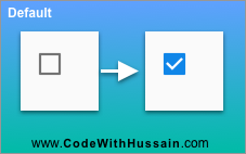
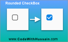
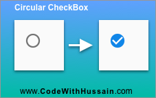
Ok, you want to create a rounded or circular checkbox in Flutter. We will create rounded, circular and a custom check box widget in this flutter tutorial.
I know you want exact use case that you want to use in your code.
Here is your code snippet. Hopefully it helpful.
Rounded Check Box Code Snippet (Short Answer)
Checkbox(
            shape: const RoundedRectangleBorder(borderRadius: BorderRadius.all(Radius.circular(5.0))), // Rounded Checkbox
            value: checkBoxBooleanValueVariable,
            onChanged: (inputValue) {
              setState(() {
                checkBoxBooleanValueVariable = inputValue!;
              });
            },
          ),
You can see we are using setState() method. It can only be used inside the stateful widget so make your widget stateful. Also create a state variable with name checkBoxBooleanValueVariable. It will store the value That we get from checkbox. You can see we are getting inputValue variable from the onChange Property we use this value to change the state of the widget inside setState().
This code make the checkbox corners rounded.
Why?
shape: RoundedRectangleBorder(borderRadius: BorderRadius.all(Radius.circular(5.0))), // Rounded CheckboxThis shape property inside the check box make it rounded by 5.0 points.
Problem solved! But if you are looking for more.
In this Article
Make Check Box Widget Circular
You can make your check box circular like CircleAvatar widget.
For making check box circular, change the shape property.
shape: CircleBorder(), // Circle CheckboxYou: What is CircleBorder?
CircleBorder() is a widget that fits a circle in the available space. Just another border widget of flutter framework.
Now,
Circular CheckBox using RoundedRectangleBorder()
Same Circular Effect can also be achieved using RoundedRectangleBorder() widget border radius property. Let’s see the code solution.
shape: RoundedRectangleBorder(borderRadius: BorderRadius.circular(10.0)), // Circle CheckboxHere we just increase the BorderRadius.circular() value to 10.0. And It gives us the circle CheckBox Effect.
For rounded corners checkbox we can use two ways to make the corners rounded.
shape: RoundedRectangleBorder(borderRadius: BorderRadius.circular(5.0)), // rounded corner checkbox
shape: RoundedRectangleBorder(borderRadius: BorderRadius.all(Radius.circular(5.0))), // rounded corner checkbox
Border radius can be used as BorderRadius.circular() and BorderRadius.all() both produce the same result.
Make Checkbox Corner Rounded From CheckBoxThemeData()
Method 1 – Globally Make CheckBox Rounded
We can also change the CheckboxThemeData from the ThemeData which will apply the effect on every place where CheckBox() is showing.
MaterialApp(
      theme: ThemeData(
        checkboxTheme: CheckboxThemeData(
          shape: RoundedRectangleBorder(
            borderRadius: BorderRadius.circular(5),
          ),
        ),
      ),
      home: const HomeScreen(),
    );
Here we are just globally change the border radius of check box. And In all App where check box is showing will become rounded or circular according to our value that we pass here. If we pass 5 than it becomes rounded and if we pass 10 then it becomes circular.
Method 2 – Make CheckBox Rounded only a Single Child Widget
You can also use themeData to make a single checkBox rounded or circular by using this code snippet.
Theme(
  data: ThemeData(
          checkboxTheme: CheckboxThemeData(
            shape: RoundedRectangleBorder(
              borderRadius: BorderRadius.circular(5),
            ),
          ),
        ),
  child: YourCheckBoxListTile()
);
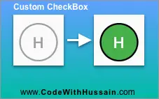
Create A Custom Circular CheckBox() Widget
This custom CheckBox will also act like a normal check box and get user input.
class MyCustomCheckBox extends StatefulWidget {
  const MyCustomCheckBox({Key? key}) : super(key: key);
  @override
  State createState() => _MyCustomCheckBoxState();
}

class _MyCustomCheckBoxState extends State {
  bool isChecked = false;
  @override
  Widget build(BuildContext context) {
    return OutlinedButton(
      onPressed: () {
        setState(
          () => isChecked = !isChecked,
        );
      },
      child: Text(
        'H',
        style: TextStyle(
          color: isChecked ? Colors.white : Colors.grey,
          fontSize: 20,
        ),
      ),
      style: OutlinedButton.styleFrom(
        backgroundColor: isChecked ? Colors.green : Colors.transparent,
        padding: const EdgeInsets.all(13.0),
        shape: const CircleBorder(),
        side: BorderSide(
          width: 2,
          color: isChecked ? Colors.black : Colors.grey,
        ),
      ),
    );
  }
}
Here we have created a custom stateful class. with name MyCustomCheckBox and define a variable name isChecked.
After that we use OutlinedButton Widget in which we style the outline button in a way in which its look like a circular selectable button.
And finally we receive the value inside the isChecked variable. And use it to display different colors on the screen.
